yusylvia

Posts Tagged ‘symbols’

Cultural Differences in Symbols and Colors

In Design Theory on March 10, 2010 at 12:35 am

With the continuous technological advancements, societies around the globe are becoming closer together each day. Gone are the days when graphic designers create for their own culture. Nowadays, in order to successfully communicate to a wide audience, we must recognize the fact that things (objects, shapes, colors, etc.) carry different symbolic meanings to different cultures. Careful and thorough research effort is crucial before the design is published or we risk generating undesired controversy, or some big laughs.

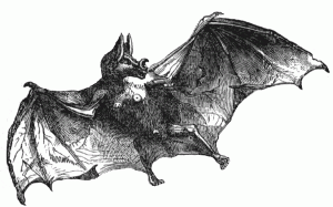
One of the examples of symbols I found that has different meanings in different cultures is bats.
bat symbolizes demon and evil spirits in the west

bats mean good fortune in the east

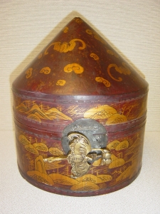
Late Qing Dynasty wedding cake box — the bat is part of the overall design on the box as well as the metal closure

While the bat usually represents demons and evil spirits in the Western world, it symbolizes good fortune in Eastern countries.

Color is another design element that graphic designers must carefully consider when creating cross-cultural design work. In the Western culture, brides wear white on their wedding day because it signifies purity and righteousness. In China, on the other hand, it is a color of funeral, mourning, and death.

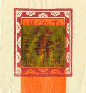
A few years ago, the paper crafting business here in the United States began selling some paper products bearing gold leaf as well as Chinese writing (see image below). It became an instant hit among crafters because of the popular Asian theme and the inherit meaning of luxury that gold leaf has in our world. What the merchants did not communicate was that this is joss paper (hell money) — something that Chinese people burn to send to their loved ones who have past away so they have money to spend in their after life.

joss paper

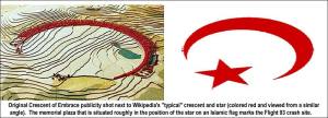
While the above example became an object of ridicule, some other mistakes can create much more significant consequences. Take the Flight 93 Memorial proposal for example. It was designed by Los Angeles architect Paul Muldoch to honor the 40 heroes who gave their lives taking down a terrorist on September 11, 2001 before the plane crashed in Pennsylvania. He named it “Crescent of Embrace.”

flight 93 memorial proposal

The design of the memorial generated much controversy because the overall shape of it resembles the crescent and the star on the Islamic flag. In this case, instead of a local designer created something that upset a foreign culture, it actually angered citizens of our own. Many have been petitioning to the government for a design change. I believe that the architect designed the memorial out of total respect and admiration toward the bravery of these heroes because another article detailed how exquisite the overall design is. This demonstrates how innocent design work can be interpreted in a total opposite direction when it is most unexpected.

Sources:
http://etc.usf.edu/clipart/1700/1770/vampire-bat_1_lg.gif
http://hwlf.files.wordpress.com/2009/09/late_qing_dynasty_wedding_cake_box.jpg
http://media.photobucket.com/image/islamic%20symbol/AlecRawls/MockUpandCrescentBorderedWithCaptio.jpghttp://www.crossroad.to/Books/symbols1.html
http://pittsburgh.about.com/od/flight_93/ss/memorial_photos.htm
http://www.chinahistoryforum.com/index.php?/topic/16269-what-does-red-colour-mean-in-chinese-culture/?s=f9f4e354d2e6435cbc89d6dfc226df10
http://www.luckymojo.com/gay-vang-bac-tho-joss-paper.jpg
http://www.ridingthebeast.com/articles/colors/
http://www.wnd.com/index.php?fa=PAGE.view&pageId=60990
Signs: Symbol, Index, and Icon

In Design Theory on March 8, 2010 at 12:13 am

A sign can be defined as a lettered or patterned board that conveys meaning, command, or directions. Another kind of sign is more intangible or spiritual, like, “a sign of success.” For a graphic design discussion, let’s stick to the first definition. Generally speaking, there are three types of signs: symbol, index and icon. Depending on the project requirements, we may be asked to design one or more of these sign types. Let’s look at the differences and some examples of each.

Symbol
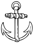
A symbol does not have direct connection to what it represents. The meaning usually needs to be learned through association.

Index
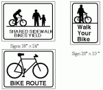
An index is a sign that directly points to the message or instruction.

Icon
An icon is directly related to what it represents, the meaning is immediately evident and it can be a smaller part that represents a whole.

Symbol, Index, and Icon examples

Sources

Sobottka, Jason, 2010. HUM311 lecture.
http://www.depauldeltagamma.org/#/delta-gamma-facts/4529840416
http://blogs.sfweekly.com/thesnitch/gecko.jpg
http://disney-stationary.com/coloring-book/Aladdin/Disney-Princesses-Jasmine-Coloring.jpg
http://www.uoregon.edu/~uplan/plandoc/BikePlan.html
http://store.theexitstore.com/merchant2/graphics/00000001/exitsign-bg-selflluminous-b.gif
http://www.squidoo.com/WDWheightrestrictions?utm_campaign=direct-discovery&utm_medium=sidebar&utm_source=oneskms
http://www.incontrol.org.uk/site/INCO/Templates/News.aspx?pageid=7&cc=GB
http://www.cksinfo.com/clipart/traffic/roadsigns/warnings/deer-crossing.png
http://www.howtodrawguide.com/wp-content/uploads/image/how-to-draw-cartoons/draw-mickey-mouse/mickey-white-papers.jpg

Symbolic Meaning Integration in Design and its Influence on Product and Brand Evaluation — A Review

In Applied Design on October 5, 2009 at 5:52 pm

The authors of this article were studying the importance of symbolism in design and marketing toward product and brand evaluations. The article presented previous study findings that illustrate how congruent use of different design elements across multiple visual communication media, such as product packaging, advertisements and websites, can positively influence consumers’ perception of a new product and brand. In contrast, the use of different design elements, such as shapes and typefaces, communicating incongruent messages, may result in ambiguity and, therefore, negatively affect the product and brand evaluations.

Also presented in this article is another study that found consumers’ tolerance for ambiguity is affected by their daily lives and can vary depending on the events. With this knowledge, the authors predicted that incongruencies in product designs should only negatively affect the product and brand evaluations for consumers in high need of structures, the ones who value predictability.

In the study that the authors conducted in a Dutch supermarket, 109 participants were told that they were conducting a study exploring consumer impressions of a new brand of soft drinks. The participants were presented a questionnaire which helped in determining whether they are in high need of structure or not. The authors presented the products in bottles of two different shapes, one connoted natural and the other artificial. These products were paired with slogan that provoked similar meaning as the bottles, and then separately paired with slogan that conveyed a conflicting meaning. Read the rest of this entry »